


To prepare for our future image effects, we’re going to set up a card component that has a large image at the top followed by a headline and description. The common problem with this setup is that we may not always have perfect control over what the image is, and more importantly to our layout, what its dimensions are. And while this can be resolved by cropping ahead of time, we can still encounter issues due to responsively sized containers. A consequence is uneven positions of the card content which really stands out when you present a row of cards.
Another previous solution besides cropping may have been to swap from an inline img to a blank div that only existed to present the image via background-image. I’ve implemented this solution many times myself in the past. One advantage this has is using an older trick for aspect ratio which uses a zero-height element and sets a padding-bottom value. Setting a padding value as a percent results in a final computed value that is relative to the element’s width. You may have also used this idea to maintain a 16:9 ratio for video embeds, in which case the padding value is found with the formula: 9/16 = 0.5625 * 100% = 56.26%. But we’re going to explore two modern CSS properties that don’t involve extra math, give us more flexibility, and also allow keeping the semantics provided by using a real img instead of an empty div.
First, let’s define the HTML semantics, including use of an unordered list as the cards’ container:
<ul class="card-wrapper">
<li class="card">
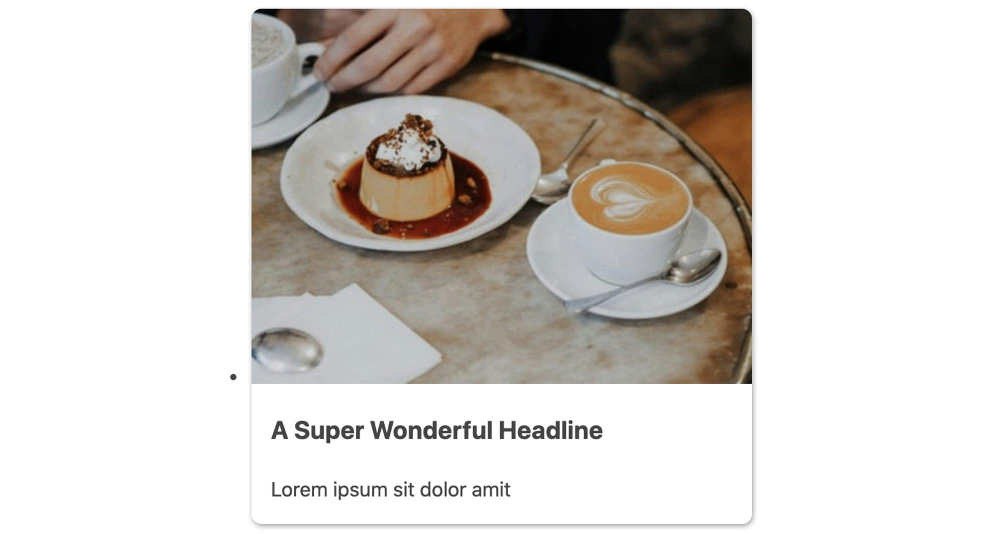
<img src="" alt="">
<h3>A Super Wonderful Headline</h3>
<p>Lorem ipsum sit dolor amit</p>
</li>
</ul>
Next, we’ll create a minimal set of baseline styles for the .card component. We’ll set some basic visual styles for the card itself, a quick update to the expected h3 headline, then essential styles to begin to style the card image.
.card {
  background-color: #fff;
  border-radius: 0.5rem;
  box-shadow: 0.05rem 0.1rem 0.3rem -0.03rem rgba(0, 0, 0, 0.45);
  padding-bottom: 1rem;
}

.card > :last-child {
  margin-bottom: 0;
}

.card h3 {
  margin-top: 1rem;
  font-size: 1.25rem;
}

img {
  border-radius: 0.5rem 0.5rem 0 0;
  width: 100%;
}

img ~ * {
  margin-left: 1rem;
  margin-right: 1rem;
}
The last rule uses the general sibling combinator to add a horizontal margin to any element that follows the img since we want the image itself to be flush with the sides of the card.
And our progress so far leads us to the following card appearance:
Finally, we’ll create the .card-wrapper styles for a quick responsive layout using CSS grid. This will also remove the default list styles.
.card-wrapper {
  list-style: none;
  padding: 0;
  margin: 0;
  display: grid;
  grid-template-columns: repeat(auto-fit, minmax(30ch, 1fr));
  grid-gap: 1.5rem;
}
As demonstrated in the preview image, these baseline styles aren’t enough to properly contain the images given their varying natural dimensions. We’re in need of a method to constrain these images uniformly and consistently.